Finally poked around Sketchbook Pro long enough to figure out how to use the paint tools more effectively. Well slightly more effectively anyway. Figured I needed to sort out something to draw/paint as a result. The lack of tiny screaming people was due to scale. I tried drawing a few tiny Lego men, but due to the scale they would have to have been tiny specs almost. Then when I changed the image to have the building be smashed I reasoned to myself the area would have been evacuated.
Should I change my mind on this one and look for a way to rework the buildings and add some color I'll add some sort of tiny military defense force on the ground too. Nothing too detailed if at all, the scale of the drawing itself is just too small overall to do much and I've have to scale it way up, do tons of work cleaning up the edges, and then scale it back down again.
This one comes in two flavors because I can't decide which one I prefer.
With lines on top.
Straight up painting.
And, yea, the perspective on the buildings is totally weird, but it's an improvement for the year so I just need to take mental notes on that one as usual.
Update: Touched up the lizard-beast, not the buildings though
Thursday, December 19, 2013
Sunday, December 15, 2013
Rock Giant
A few weeks ago I got it in my head to do some sort of rock creature. Sourced by a photo of a gorila I found on Google image search. Just tinkered with it a bit more and decided it was best to move on.
Not claiming victory or defeat on this one, just posting it.
Not claiming victory or defeat on this one, just posting it.
Friday, December 13, 2013
Trying backgrounds again
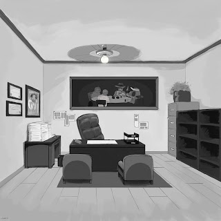
My history with art and doodling sources back to elementary school when I'd get bored and want to draw little characters over any exposed paper and later on on notes in jr. high and high school. Nothing fancy, but the point is I've never done much work on backgrounds, and that fact shows up to this day and irks me to the point that (finally) this year I've actively been trying to focus on expanding my abilities there.
A month or two back I started trying to create a tiny universe to write short stories in, maybe as that web comic I've been telling myself to do for a decade. The way this ties in is that my concept art went from character sketches to, you guessed it, environments... from there I ended up going back to revisiting the basics of perspective and greyscale painting environments that can be colored later on.
I had the urge to do more backgrounds after that one, but some other ideas I fiddled with didn't pan out. Can't say why, but as I was skimming animation background archives on Google and Reddit's r/animation I was reminded that reality itself need not apply to the composition so I should go dick around. Somehow from there I wound up looking up backgrounds for Ralph Bakshi's "Cool World". Probably wanted to do a nighttime downtown scene and have blocked the rest of the movie from memory.
I had originally considered adding street lights. But instead of going back and repainting a fairly large amount of it, I just made two quick layers and doodled a few lamps and light cones to see if I'd even like the look. Here's that one for posterity.
A month or two back I started trying to create a tiny universe to write short stories in, maybe as that web comic I've been telling myself to do for a decade. The way this ties in is that my concept art went from character sketches to, you guessed it, environments... from there I ended up going back to revisiting the basics of perspective and greyscale painting environments that can be colored later on.
This one started out as a simple 1-point perspective line drawing that I colored right off without any underpainting. It didn't work out and my colorblindness handicap had me selecting some colors that I was told were a little too odd. So I duplicated the layer, converted it to grey (or saturation to 0 if you prefer), and used that as a baseline for bringing up the light values accordingly, eventually adding more details with great ease comparably.
These colors are mostly the originals. Not totally sure what the actual color names even are because I can tell from the red hints that I'm just unable to see some of it how most people do. But the important part is that it looks many, many times better than it originally did and was easier too. I still prefer someone else to help me with colors though, for the sake of humanity.
I had the urge to do more backgrounds after that one, but some other ideas I fiddled with didn't pan out. Can't say why, but as I was skimming animation background archives on Google and Reddit's r/animation I was reminded that reality itself need not apply to the composition so I should go dick around. Somehow from there I wound up looking up backgrounds for Ralph Bakshi's "Cool World". Probably wanted to do a nighttime downtown scene and have blocked the rest of the movie from memory.
I had originally considered adding street lights. But instead of going back and repainting a fairly large amount of it, I just made two quick layers and doodled a few lamps and light cones to see if I'd even like the look. Here's that one for posterity.
Subscribe to:
Comments (Atom)


